November 11th 2020
Improvements to marketing, design, and more
A wide range of changes to all Monitor reports went live today.
Easier access to more information
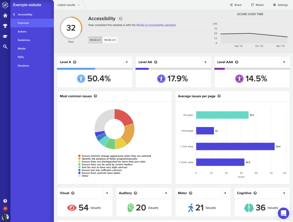
Our reports have been refined to present more key information easier. For example, our new Accessibility summary includes breakdowns by type of disability and more:
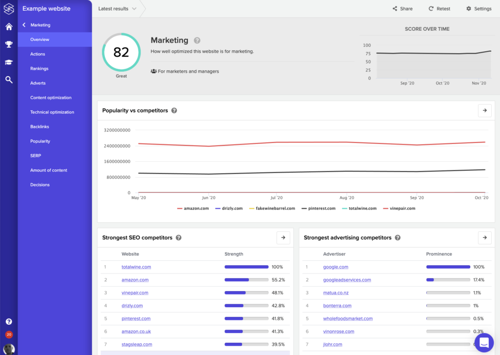
Our new Marketing summary includes a wealth of new summaries about the website's popularity, rankings, and adverts:
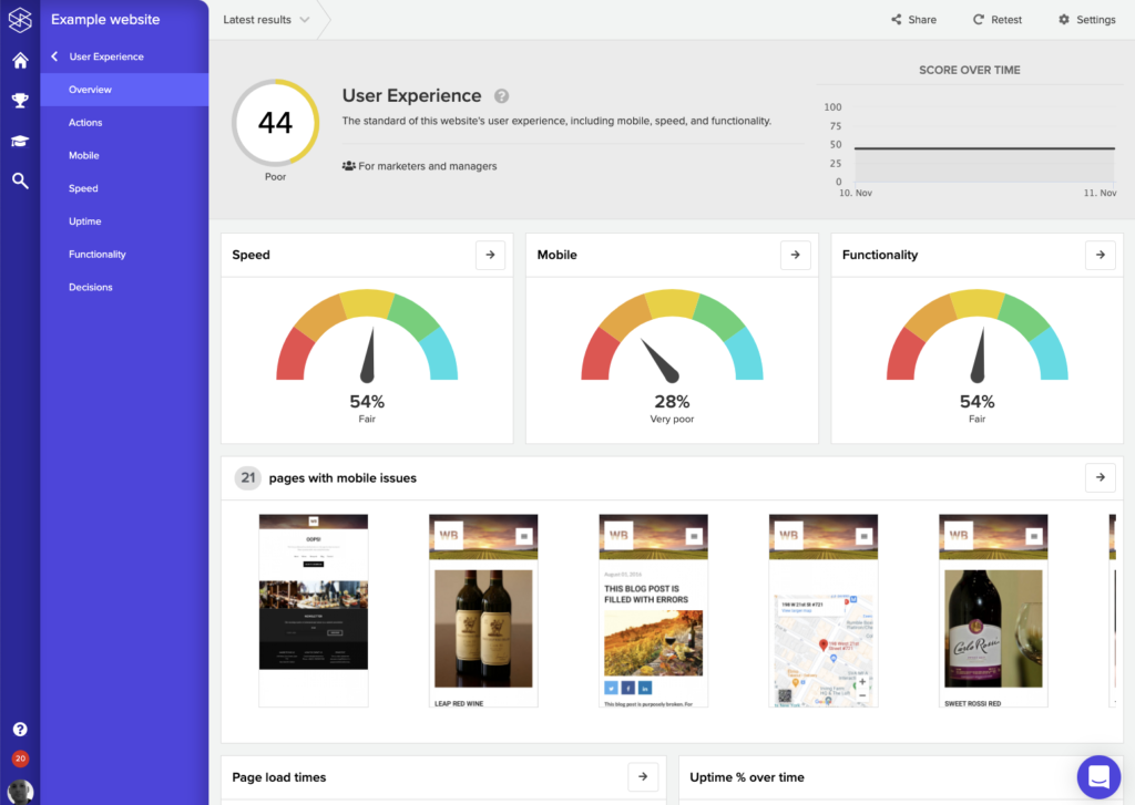
User Experience makes it easier to appreciate speed and mobile issues:
This is just a sample of dozens of changes. Depending on your account configuration, you may see different screens from these.
Search engine rankings
The Ranking screen (previously "Keywords") has been substantially expanded. This now shows a graph of your overall keyword rankings:
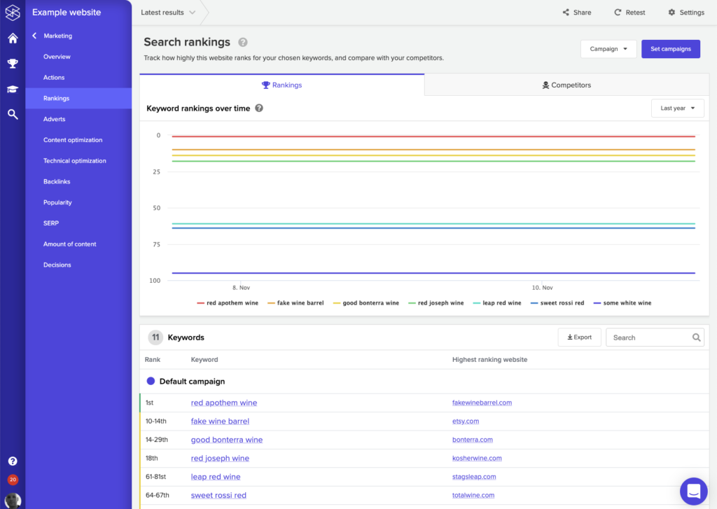
You can now view a list of your top ranking competitors under the "Competitors" tab, and click on a competitor to view what keywords they rank for over time.
We've made similar enhancements to the Adverts screen, which now includes a list of the strongest advertisers for all of your keywords.
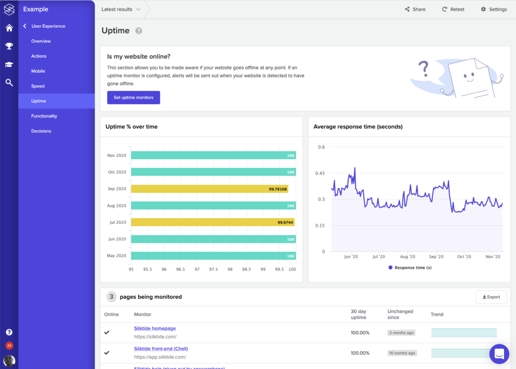
Enhanced uptime
The Uptime screen now graphs of the % of uptime and the average response time for the past 6 months. These charts are available for both individual checks, and across all checks.
So what else is new?
- If a website doesn't specify competitors manually, Silktide will now guess 5 competitors based on what websites rank highest for the keywords provided for the website. This information is uses for the Popularity screen.
- Many screens now show an overall "progress" gauge which shows progress towards completion in a given area.
- Accessibility issues can now be filtered by the modality they most likely impact, e.g. "visual", "auditory", "motor", "cognitive".
- The icons for priorities have been redesigned to have distinctive shapes (e.g. top priority is a circle, second is a triangle, third is a square, and so on). This removes the dependency on colour to discern this information.
- Various refinements and bug fixes.